I named this picture "dismay" because I feel hopeless when it comes to FB. I am so SICK and Tired of Facebook and you're right.- most people mindlessly scroll through the content of other people's lives when they are bored. Although, I think this is the case for all social media, but FB especially. I also hate that FB is connected with EVERYTHING. "No, I don't want to sign in using my Facebook, account!" Geez. Ok, I'm off my soapbox now and on to your picture. I really like the picture?
I think this picture is like an ad for Facebook or the iPhone or the integration of Facebook on the iPhone. it totally looks commercial, so I agree with Professor Simon. I like the composition--the high angle works and you really filled the frame with the subject. The background is a nice contrast - blue and green works. The rich deep blue is nice and your focus is on point. You added the hand, which I think is crucial in selling this theme of boredom. So I think you did a great job with that. I would like to see more interaction --like scrolling through the pages and I think that would help the "ad" feel a little.
I would improve the exposure on the hand. Your thumb looks a little blown out. Did you use fill flash or a pop of flash on the image? The whites are teetering on being a little overexposed. But overall, I like your thought concept behind this image. I think you really made the theme current with the trends of today's generation.
I completely understand where you're coming from, but my first impression was this was an ad for the FB operating system phone.
ReplyDeleteThis comment has been removed by the author.
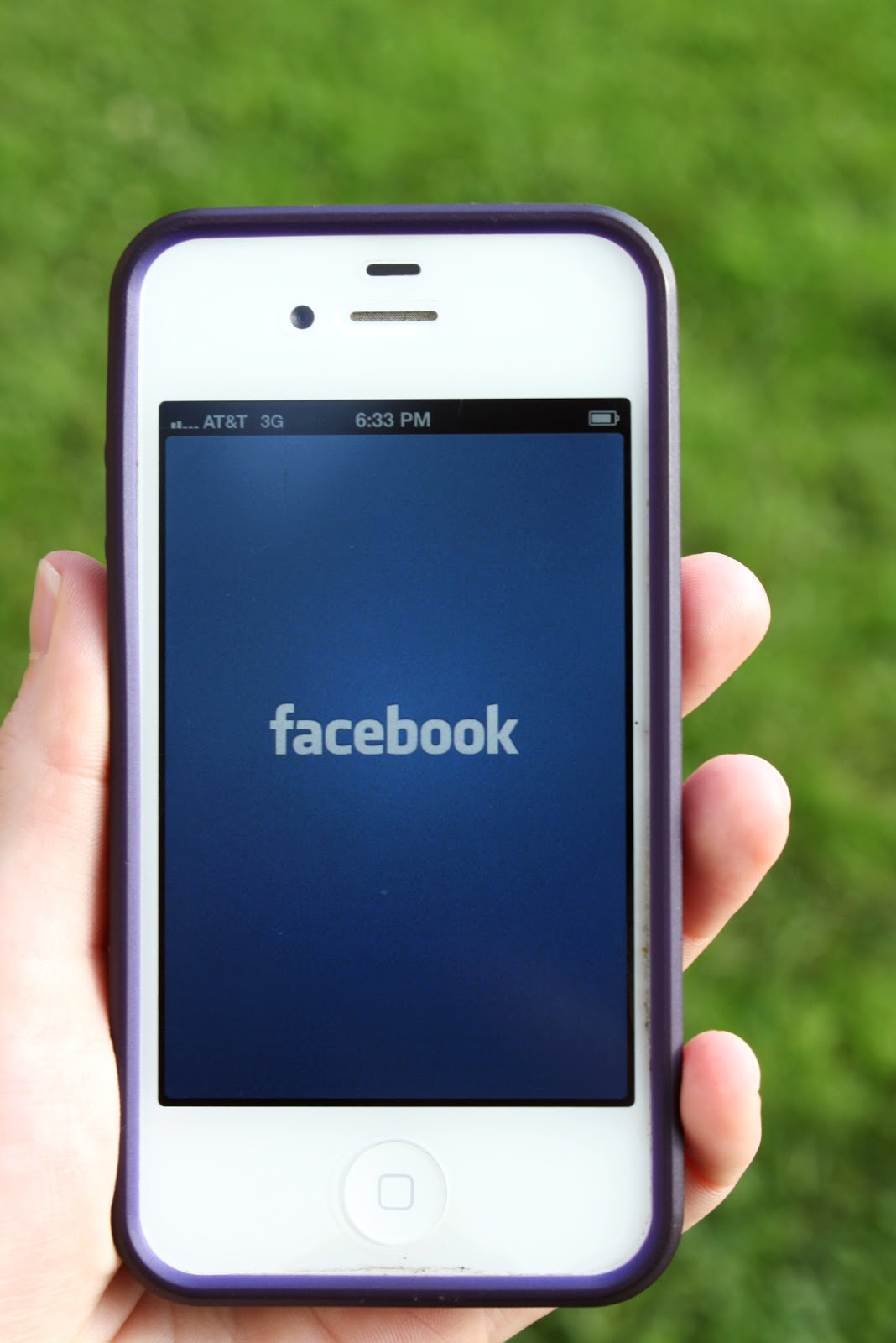
ReplyDelete"Dismay"
ReplyDeleteI named this picture "dismay" because I feel hopeless when it comes to FB. I am so SICK and Tired of Facebook and you're right.- most people mindlessly scroll through the content of other people's lives when they are bored. Although, I think this is the case for all social media, but FB especially. I also hate that FB is connected with EVERYTHING. "No, I don't want to sign in using my Facebook, account!" Geez. Ok, I'm off my soapbox now and on to your picture. I really like the picture?
I think this picture is like an ad for Facebook or the iPhone or the integration of Facebook on the iPhone. it totally looks commercial, so I agree with Professor Simon. I like the composition--the high angle works and you really filled the frame with the subject. The background is a nice contrast - blue and green works. The rich deep blue is nice and your focus is on point. You added the hand, which I think is crucial in selling this theme of boredom. So I think you did a great job with that. I would like to see more interaction --like scrolling through the pages and I think that would help the "ad" feel a little.
I would improve the exposure on the hand. Your thumb looks a little blown out. Did you use fill flash or a pop of flash on the image? The whites are teetering on being a little overexposed. But overall, I like your thought concept behind this image. I think you really made the theme current with the trends of today's generation.
Good job.